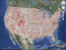
1998
It turns out that the housing bubble shows up relatively subtly in this particular variable, and in particular doesn't seem to explain all that much of the geographical variation (which is kind of a bummer after I expended so much work to make the animation!)
If you watch the most bubbly areas (like Florida or Nevada) you can see them darken a little as they go through the height of the bubble in about 2006, and then lighten after. However, a lot of the highest color areas in the inter-mountain west I'm guessing have to do with rural counties with strong retirement/second home activity (meaning there is relatively little wage income besides building things).
I live in KS. I am completely perplexed about the usefulness of this information since Jefferson County, KS is dark red the entire time. It's only a population of 18,421 (Jul 2008). The construction wage population is probably less than would work on one highrise in NYC. It seems that making this data by county makes for entirely outrageous swings that throw off the visual perception. In my opinion, the data would be more well served numerically, without the photo, and on a larger scale than counties.
ReplyDeleteD:
ReplyDeleteI'm not entirely happy with the result either. However, sometimes there's no way to figure out what something like this will look like, or reveal, except to do it and find out.
If only the 'shape' of the economy resembled the shape of the area of the land mass that supports it.....
ReplyDeleteI think your work does provide more inspiration though for business intelligence dashboards that show us the state of civilization.